Beginner to Pro:
A Food Safety Adventure for Aspiring Chefs
This scenario-based eLearning experience is a conceptual project designed to help new cooks practice making decisions regarding food safety guidelines successfully in a risk-free environment.
Audience: new cooks at a contemporary-casual restaurant with multiple locations across the US
Responsibilities: instructional design (action mapping, storyboarding, mockups, prototype, full build), visual design, eLearning development
Tools Used: Articulate Storyline 360, Vyond, Adobe Photoshop, Adobe Illustrator, PowerPoint, Google Docs, MindMeister, Freepik
The Problem and Solution
In the restaurant industry, newly employed cooks are making food safety errors in the kitchen. These mistakes can lead to significant consequences including business costs, the health of the customers and employees, and the reputation of the restaurant.
While working with a subject matter expert (SME) in the restaurant industry, it became clear that new cooks are unaware of best safety practices when it comes to proper food storage, sanitization practices, and the importance of recipe compliance. These insights inspired me to create a scenario-based eLearning that would allow new cooks to make decisions regarding these food safety practices in a risk-free environment. This type of story-driven eLearning allows the learner to experience realistic, memorable consequences with the goal of implementing proper practices in the real world moving forward.
Question 1 Slide
My Process
To bring this project to life, I leaned on the structure of the ADDIE model. For the analysis phase, I met with my subject matter expert (SME) to gather information and create an action map that would serve as the foundation of my text-based storyboard as I entered the design phase. I continued to consult with the SME while designing the flow of the eLearning story in the storyboard.
Once the storyboard was approved, I focused my attention on visual design and created the high-fidelity mock-ups. When given the go-ahead on the visual design, I moved seamlessly into the development phase by creating a prototype to showcase the interaction of the eLearning. From there, I was able to dive in and develop the project in its entirety.
Once the eLearning was fully developed, I asked peers and professional instructional designers to evaluate the project and provide feedback so that I could apply iterations and ensure smooth functionality and consistency across the design.
Action Map
I consulted with a top-performing cook from the culinary industry as my SME. Together, we created an action map that outlined common mistakes that are made by new cooks. Through this process, we noticed a common theme with food safety guidelines. This insight allowed us to create the learning goal we wanted to achieve with the eLearning: new cooks will understand and follow food safety guidelines 100% of the time by handling and storing food properly.
From there, the SME narrowed down the top three high-priority actions that would serve as the foundation for this eLearning: proper food storage, correct sanitation practices, and the importance of recipe compliance.
Action Map
Text-based Storyboard
Once the action map was complete, it was time to design the flow of the eLearning story through the text-based storyboard. This was a significant step that served as the blueprint for the overall development of the project.
I started by visualizing the story of a new cook navigating his first day at the restaurant. From there, I was able to craft choices and detailed consequences for each high-priority action highlighted in the action map. I continued to collaborate with my SME throughout this step to ensure the actions and consequences were accurate.
The storyboard went through multiple rounds of feedback from professional instructional designers and the SME. This was my favorite part of the storyboard process, as I was able to make iterations based on how the story and actions were received by professionals. Collaborating with other professionals and getting a fresh perspective on my work is important to ensure consistency, functionality, and overall flow of the eLearning experience being brought to life.
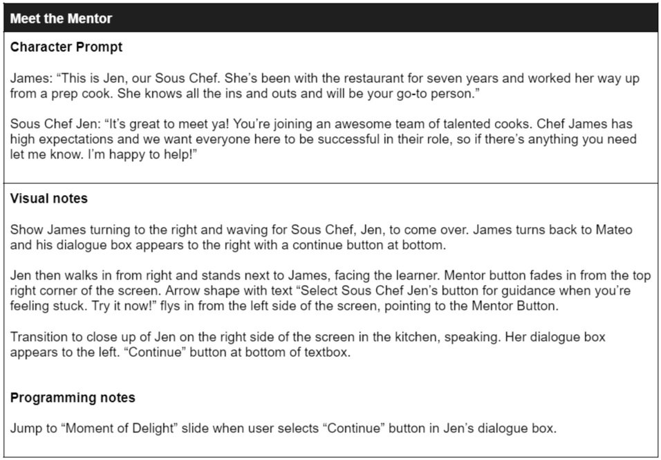
For additional guidance, I created a mentor character as a fun, interactive way to provide on-demand information for each question if the learner felt stuck. I also created a moment of delight (MOD) wheel as a reinforcing gamification component. When the learner chooses the correct choice, ⅓ of the wheel will fill in after the positive consequence plays out, changing to a chef’s kiss at the end for an unexpected surprise.
Slide from text-based storyboard
Mentor Character, Jen the Sous Chef
Moment of Delight (MOD) Wheel
Visual Mockups
Once I received approval on the storyboard, I moved forward to visual design. I used PowerPoint to create a mood board and style guide, as well as the wireframes and high-fidelity mockups. I incorporated the client’s brand colors into the style guide and chose a font that would complement the tone of the project.
From there, I created wireframes to get a sense of the formatting for each type of slide (title, mentor guidance, question, consequence, etc). This allowed me to smoothly transition into designing high-fidelity mockups. This was a significant and exciting part of the process, as it allowed me to get a feel for what the project would look like. After receiving feedback from professional instructional designers and implementing some formatting and visual iterations, I felt confident in the visual design and moved forward to prototyping.
Style Guide
Wireframes
High-Fidelity Mockups
Interactive Prototype
I developed an interactive prototype to collect feedback on the functionality of the project before diving in and developing the project in full. This part was the most exciting for me because I was able to see the story in action through the amazing animations in Vyond. The prototype included the title slide, introduction, meeting the mentor, introducing the moment of delight wheel, question 1, and the incorrect and correct consequences based on the choices given.
In Vyond, I thoughtfully envisioned each scene and modified the characters’ movements and expressions to match the tone of the story. This involved paying close attention to timing and developing multiple scenes in Vyond to be transferred to a single slide in Articulate Storyline 360.
In Storyline, I focused on the design and placement of the prompt textboxes and dialogue boxes. This included button prompts that were customized based on dialogue in a scene, incorporating hover states to the buttons, and fade transitions between scenes for effect.
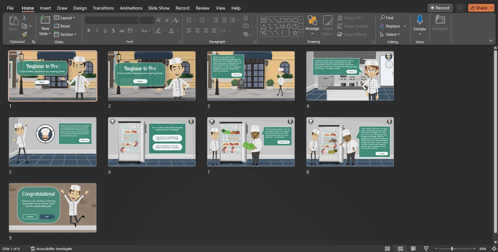
I also incorporated the use of Adobe Photoshop and Illustrator to manipulate sourced images from Freepik and Vyond. For example, the food in the refrigerator was sourced from Vyond, but the refrigerator was sourced from Freepik. Therefore, I saved these images separately, adjusted them as needed in Photoshop, and added them into Articulate Storyline 360, where I could properly place them with the animated scene from Vyond running in the background.
Example of creating a scene in Vyond
Completing the scene build out in Storyline after importing from Vyond
Full Development
After collecting feedback and applying several iterations to the prototype, it was time to develop the project in full. The project consists of 120+ scenes designed in Vyond and transferred to Articulate Storyline 360.
Favorite features:
Various animations: Developing this eLearning in Vyond allows the learner to be immersed in the restaurant kitchen environment and experience the story along with the characters. It also reinforces the learner’s interest and curiosity throughout the eLearning with continuous movement and changing expressions from the characters.
Zoom regions: These were intentionally placed throughout the eLearning to showcase a key feature of a scene or set a specific tone based on the storyline. I wanted to focus the learner on what was important in these scenes so the story would continue to flow as planned.
Sound effects: Though minimal, the sound effects were incorporated at significant moments in the story. My goal was to not overwhelm the learner with a lot of repetitive background kitchen sounds, but rather focus the select sounds on key moments for dramatic effect.
Transition slide to the eLearning conclusion
Reflection and Takeaways
Timing is crucial: It took a lot of finessing in Vyond and Storyline 360 to ensure the animations aligned with the text prompts and moved along at a reasonable pace for the learner. A tool that helped me with this was using a stopwatch while I read the prompts to accurately estimate the time needed for each scene. I know from my own experience interacting with eLearnings that it’s a fine line finding the right pace, and I wanted to make sure I gave this extra attention to avoid a frustrating experience.
Sound and video inspiration: Though sound effects were minimal in this project, I feel the intention behind them added the dramatic tone I was seeking to the story. This has inspired me to find new ways to implement sound effects in future projects. I’m also eager to explore other authoring tools, like Captivate and Camtasia, to continue to upskill and utilize animations and video recording.
Text-based vs visual storyboard: Completing the text-based storyboard was the most challenging part of the process for me. Though I enjoy writing, I’m a visual learner, so envisioning the entire storyline through text took longer for me to complete than I initially thought. Next time, I’d like to try utilizing a different storyboard template that incorporates the visual aspect of the project as well. By doing this, my hope is that the storyboard process will be smoother and more enjoyable for me.
Appreciation for the ID process: The instructional design process consists of many steps, feedback loops, and iterations. Though I knew the process going into it, it’s a different experience when you’re head-first developing a project. It’s something that can’t be rushed and requires a thoughtful mind, an eye for detail, and patience with technology. Though some steps were more challenging than others, I absolutely loved bringing my vision for this project to life and am humbled by the work it took to get here.


